Minimal Brand Identity for Sundaze by Caterina Bianchini

ibby
Oct 16, 2017
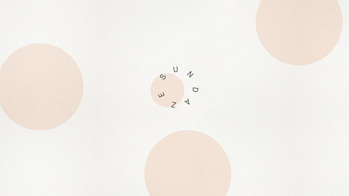
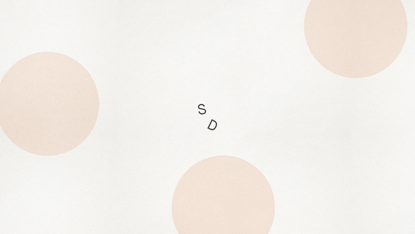
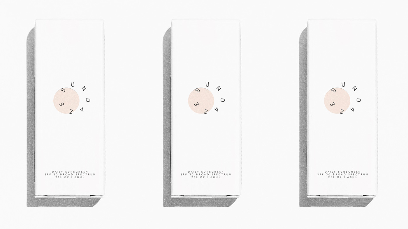
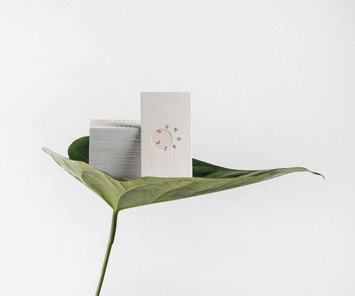
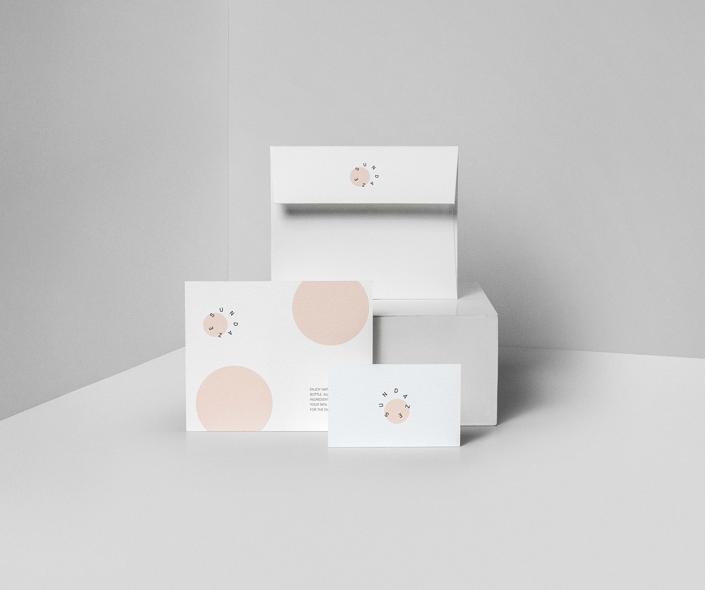
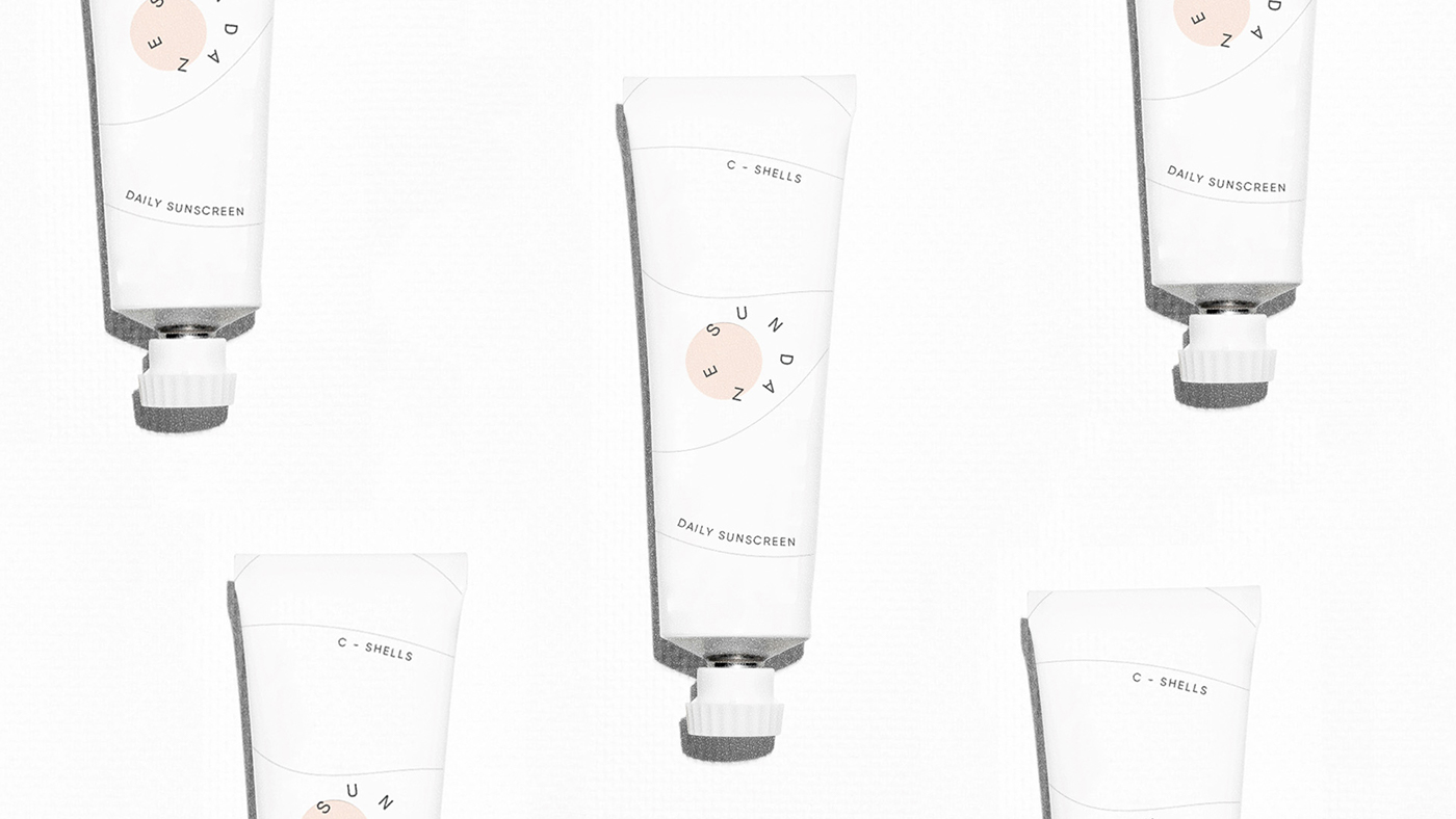
We just scooped and had to share the elegant brand identity work by Caterina Bianchini for San Francisco-based skincare brand Sundaze. Caterina’s design is meant to explore the use of unique graphic placement. The logotype has been developed to sit like a partial eclipse, giving a subliminal nod towards the products main purpose, as a daily sunscreen. The placement of the letters of ‘Sundaze’ draw reference from sun rays with the end result being a logo that completely references the sun. The design is continued across the packaging creating a coherent and bold range with a quirky design and a flexible logo that carries a unique personality setting it apart from a cluttered industry. Be sure to check out Catarina’s Behance for more beautiful and perfectly minimal branding work.


ABOUT SUNDAZE
Sundaze is a modern skincare brand born from the sun-soaked streets of San Francisco, California. Sundaze is a beauty company that’s main focus is the production of sunscreen. The company hopes to modernise the market through bold design choices and a new wave of organic sunscreen, that all have a brightening and moisturising effect. Sundaze is made with a difference, all the products are natural and completely free of parabens, the ingredients are hand-picked and it has a no stick and a grease-less texture.