Poster Girls Showcases the Golden Age of London Transport Poster Art

A new exhibition at the London Transport Museum is uncovering a long-neglected art associated with England’s transportation systems: Poster Girls tells the tale of women designers, who played an enormous role in defining the transportation spaces with their colorful, informative and intriguing poster art.
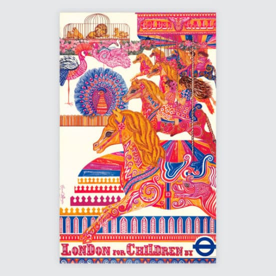
David Bownes, the curator of Poster Girls, said he wanted to highlight neglected and forgotten works of art. “Ultimately, you don’t want to have an exhibition called Poster Girls and you want to have an exhibition that includes both men and women with no gender call-out, but right now women need to be put back into the story.”

The London Underground is well known for its use of strong design choices. In addition to its architecture and iconic logo, the transit system is famous for its excellent typography and mapping. The Underground’s design is largely a legacy of the great Frank Pick, who as managing director oversaw the entire process back in the 1920s. Pick was very interested in station posters, for the way they marketed, decorated and informed station passengers. As far back as 1908, Pick started managing the system’s poster marketing.
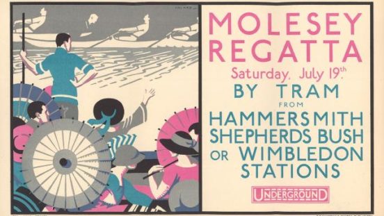
Initially he was highly influenced by the Arts & Craft movement, which believed in the aesthetic of fine, hand-crafted objects in everything from architecture to art. Pick also believed in the equality of both men and women, making an effort to hire women to design station posters and giving them a place of prominence that was equal to male designers. The early tube posters were done by women illustrators, since Pick first looked to women who were already working in publishing. That gives some of the earliest posters on exhibit are whimsical – they were drawn by artists who were children’s book designers.

“By 1920s, there are women that are working in the style of the best male designers–meaning flat color, simplified shapes–and over the 1920s and 30s [women designers] turned to graphic abstraction, or what we’d call art deco. After WWII the style had become much more illustrative.”
In compiling the posters for the exhibition, Bownes decided that the 1920s and 1930s were the “golden age” of London transportation poster design. At the time, the transportation stations were commissioning nearly 100 posters each year, making them ubiquitous throughout the city. The messages conveyed by the posters became direct, short and to the point.
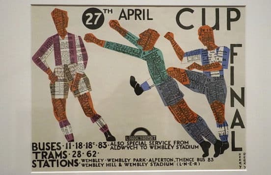
An unexpected byproduct of this process was that art and design schools started teaching poster design. Even more women learned the art, and more of them were drawn to poster art than to the other disciplines during this era. Graphic was now a viable career option for women. The tube played a key role in launching many careers in art and design. A commission from London Transport or the Post Office for a stamp was the ideal springboard for a career in design, according to Bownes.

Bownes said his favorite designer from the exhibition is Dora Batty, who started her career in poster art and later became the head of the textile design program at the Central School of Arts & Crafts. By 1950, Batty was elevated to director of the prestigious school.
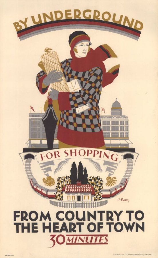
“For me, Dora Batty is the greatest of all the designers,” Bownes says. “If you look at [the 1925] ‘From country to the heart of town in 30 minutes’ that poster has got all the elements of a modern British poster from the mid 1920s: simplified colors, simplified spaces, and you see the understanding of textiles in the clothes the women is wearing. It’s spot on in the message the underground was encouraging, which was off-peak ridership. It was elegant, well observed, and appealed to a new female audience. Previously a lot of posters are designed to be looked at by men. This one shows a young , independent woman traveling to the city for her own pleasure or enjoyment. She’s not defined by her children or her husband.”

Transport of London believes around 170 women designers contributed posters for the collection, which contains about 1,0000 posters. Many of these are unsigned and despite Bownes’ best efforts, he has not been able to identify every person who contributed designs. Bownes says that’s because “The status of women was so low and some of those unsigned posters might have been women.” Although not every person can be identified, Poster Girls goes a long way in rectifying their exclusion from the narrative.

This entry was posted in Graphic Design Brisbane. Bookmark the permalink.