Stunning Brand Identity and Packaging Design for Riley®

abduzeedo
Aug 18, 2017
Riley® is a brand identity, packaging and art direction project created and shared by Panos Tsakiris on his Behance profile. I had to feature this project because it’s simply awesome. I love the simplicity and how modern it looks with a simple black and white theme. The bottles are my favorite but make sure to check out the whole process that Panos was kind enough to share with all of us on his Behance page.
The brief
‘Create a brand for the Riley brothers’ drink. You’ll need to consider everything, from the branding strategy to the design to the packaging.’
Riley&Riley Ltd. sell a drink that promises to prevent hangovers – it’s a mix of vitamins, rehydration salts, amino acids that break down toxins, caffeine and one secret ingredient. The company was founded by two brothers from Yorkshire – Tom and James Riley. They moved to London after graduating, set up their company and started manufacturing the drink.
The approach
The main inspiration for this project was the effect alcohol has on the brain and consequently the eyesight. The typeface and graphic elements were created based on this very idea.
The process
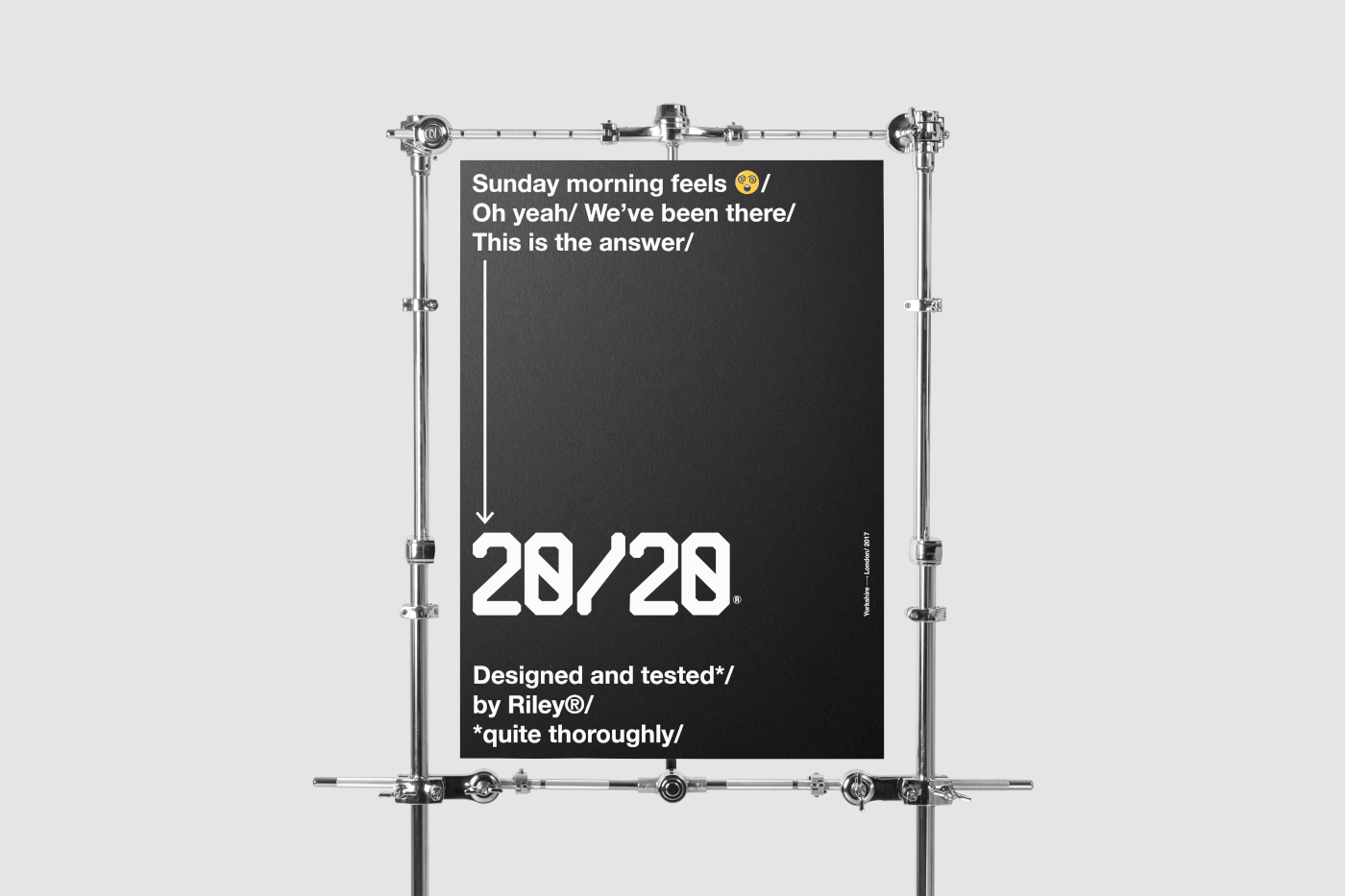
The name of the drink (20/20) is placed partially on the front and on the back of the bottle label. The more the user consumes the more visible the logo gets. When the amount reaches the lowest point, the logo gets clear -this subsequently means the user has absorbed all the required ingredients. The most important thing anyone should do to avoid next day’s hangover is to rehydrate. That is the reason why 20/20 logo has been placed near the bottom rather than the middle or top of the bottle. The user is ‘forced’ to drink in order to rehydrate.
The result
A system of clever graphic elements is designed in order to support a bold, fresh and elegant brand launch for the Riley brothers.

‘Alcohol slows the pace of communication between neurotransmitters in the brain. The delay in communication between the brain and the eyes means that they are not able to function effectively which weakens the eye muscle coordination. This is what causes distorted or double vision.’
Brand identity and packaging design


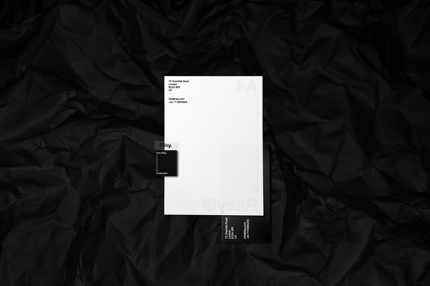


Riley®
- Co-founders: Tom Riley & James Riley
- Strategy, Design, Art Direction: Panos Tsakiris
- Type: Competition Project
- Duration: One month